WORK:
DESIGN, BRANDING, MARKETING, PHOTOGRAPHY
Paradise Garage Racing
about.
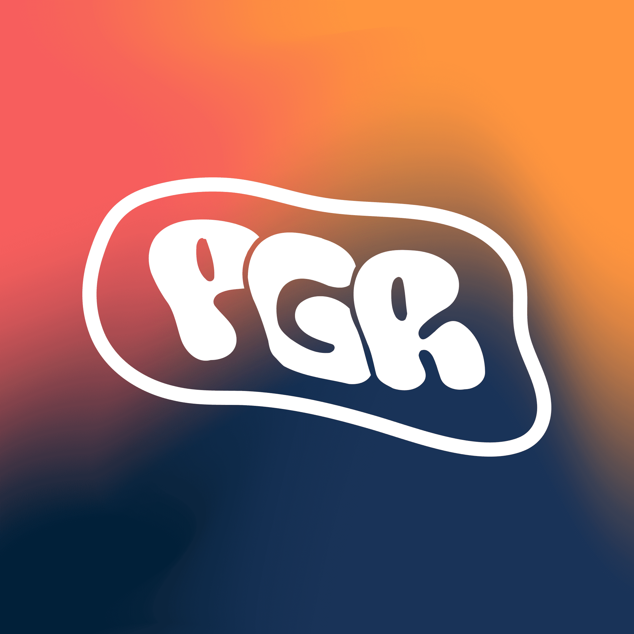
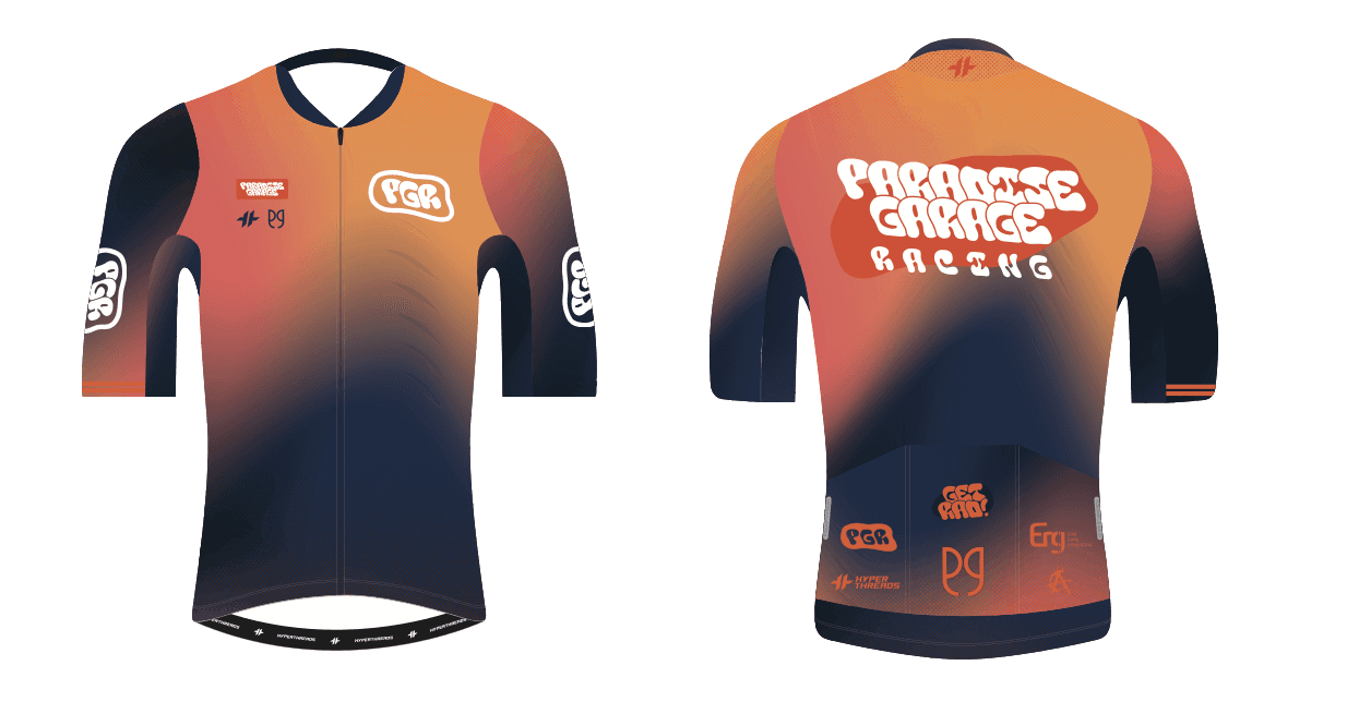
Paradise Garage Racing needed a refreshed logo and updated brand design to better represent the team’s energy and style. I created a new logo that modernized their look while preserving the team’s identity by keeping the original color theme intact. To give the brand a fresh feeling, I introduced gradient tones that added movement, creating a more visually engaging aesthetic. The result was a cohesive new look that honored the team’s history while elevating its presence both on and off the bike.


challenge.
The Paradise Garage Cycling Team recognized the need for a fresh design that better reflected their personality and presence in the cycling community. They wanted something more playful and energetic—an identity that could capture both the excitement of racing and the camaraderie of the team. A key part of this evolution was creating a logo that could seamlessly transform their name into a sleek, memorable acronym, giving them flexibility across apparel, racing kits, and other branding assets. This new approach ensured their look was not only bold and dynamic in the peloton but also adaptable and recognizable in every context.


result.
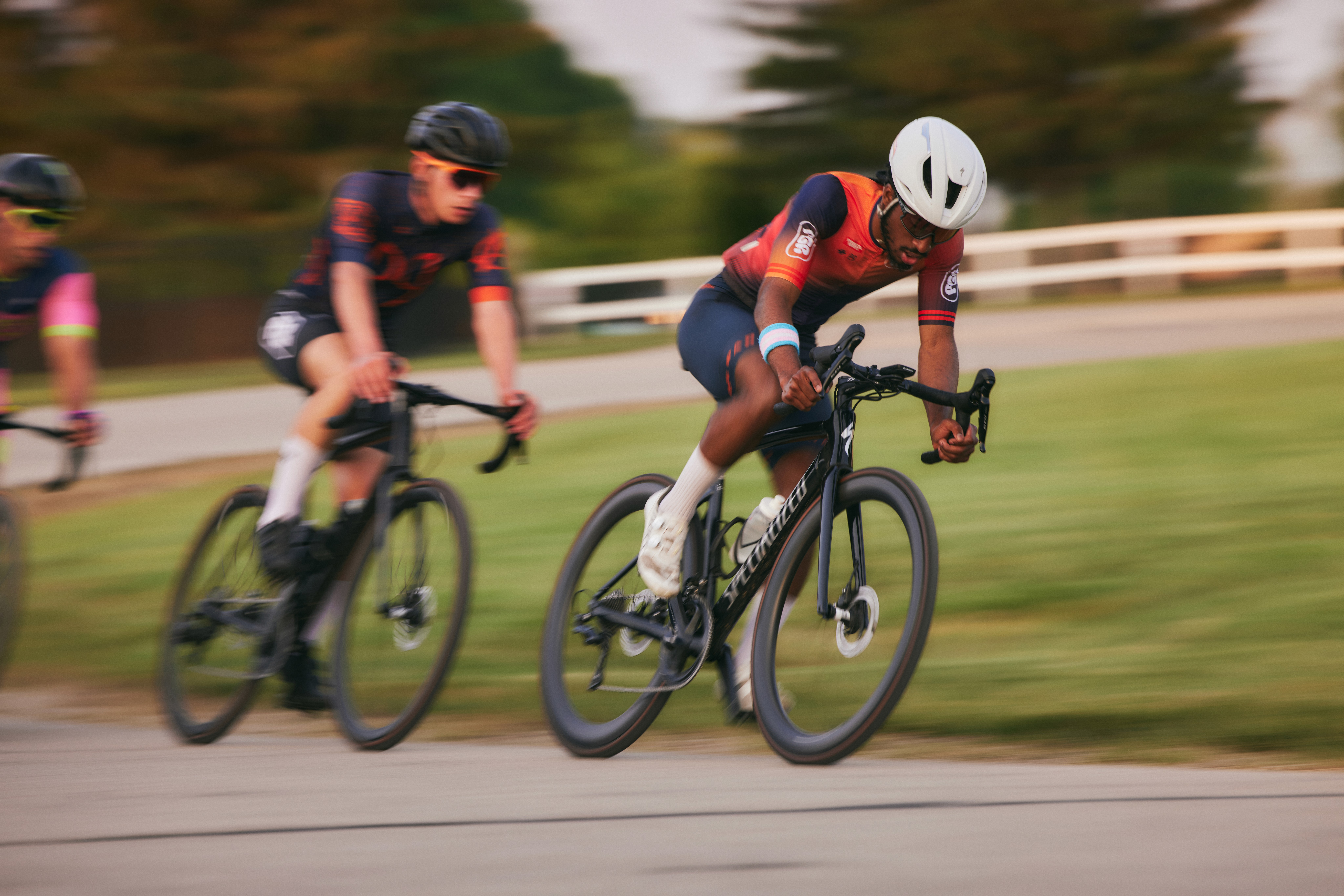
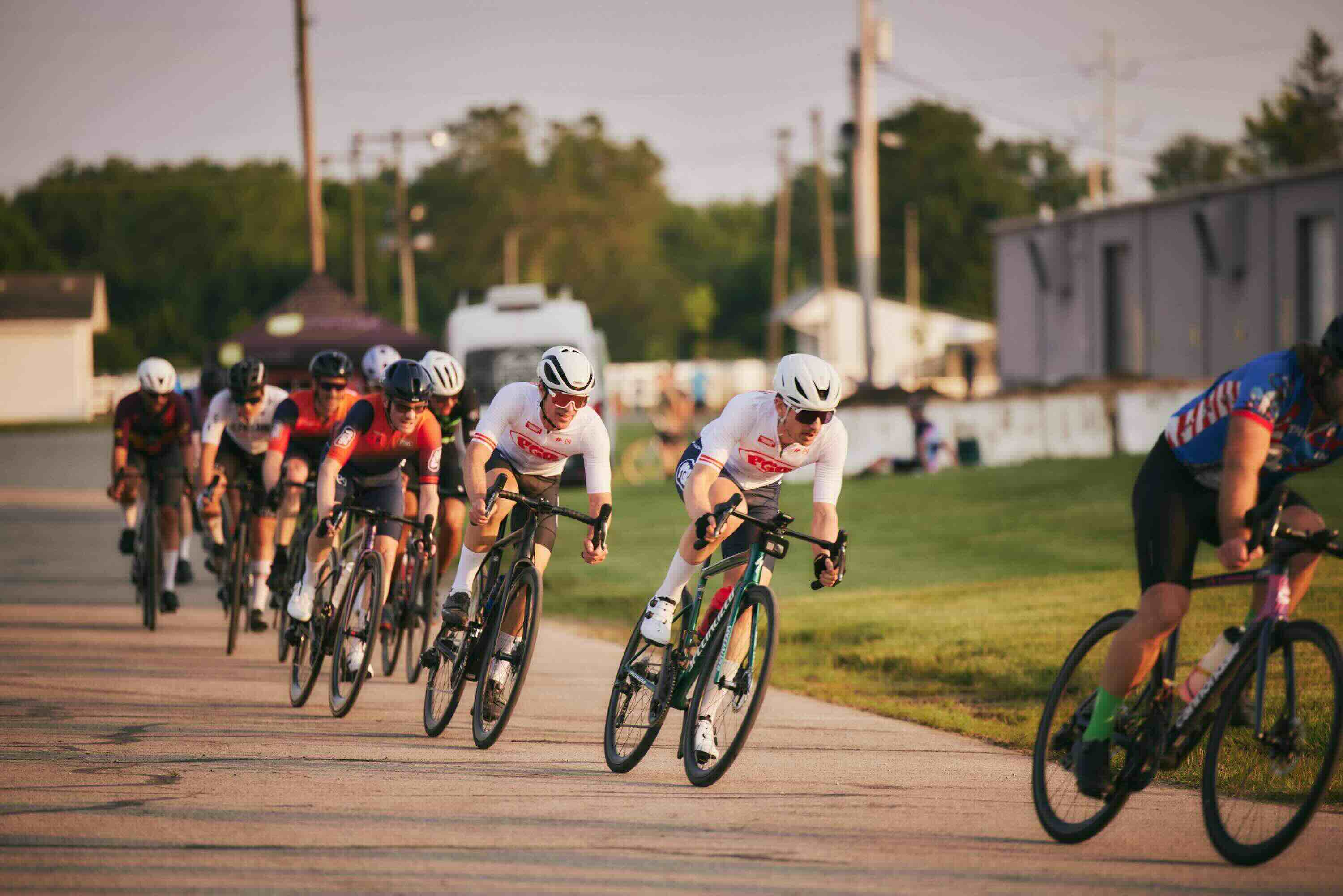
The team at Paradise Garage Racing is excited about the new brand design, and the fresh look makes their cycling kit stand out boldly in the peloton.